Birò Brand Identity
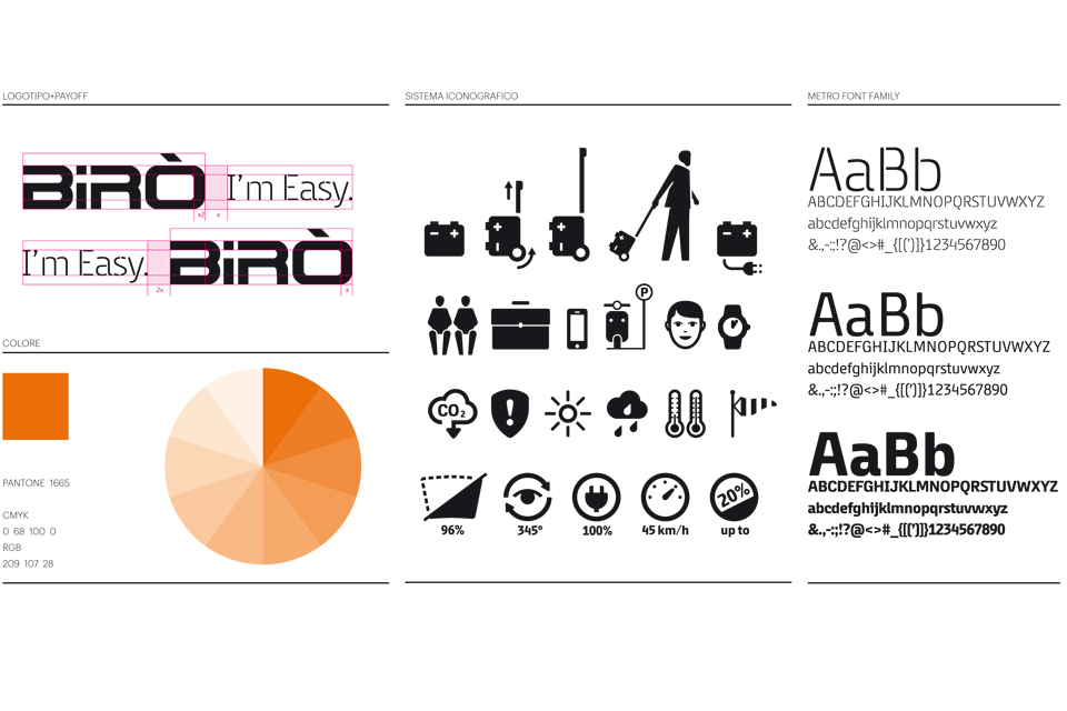
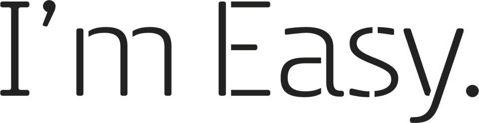
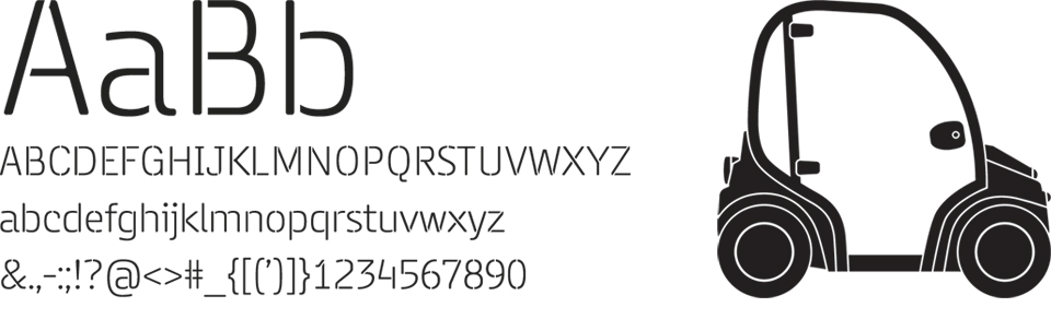
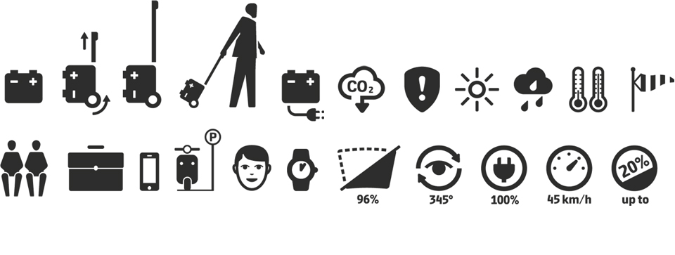
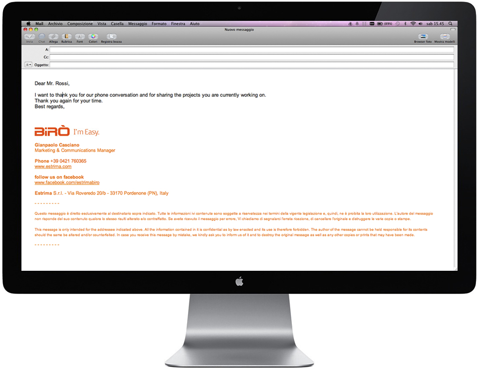
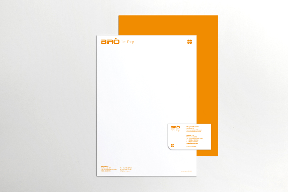
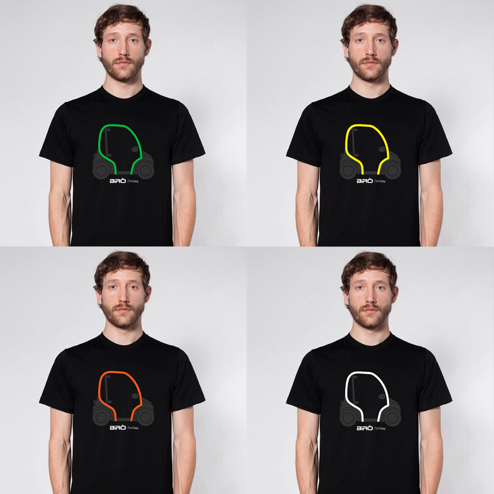
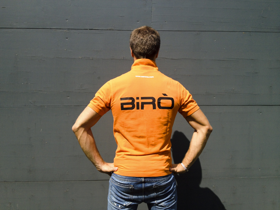
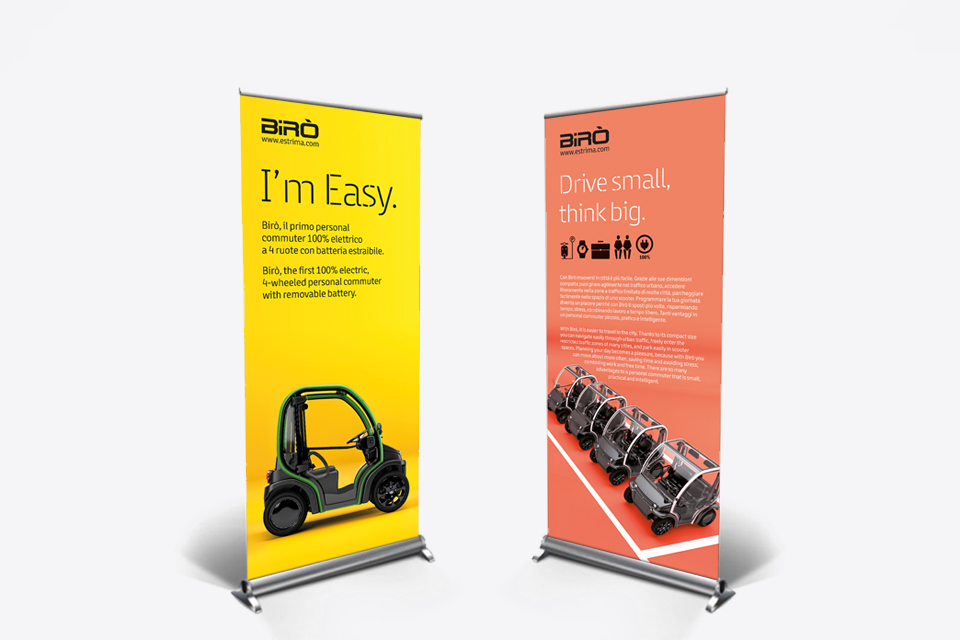
With a fragmented identity, Birò needed to find its personality. It became necessary to determine key messages, create a “tone of voice” that better reflected the brand, and develop a unique design. In 2013, I spearheaded the rebrand, which led to a new visual identity system including a distinctive font, an iconography system depicting the advantages of the vehicle, a recognizable pop color palette, and strong branding guidelines. This mix translated into an engaging and playful style that simplifies concepts through illustration and other visual devices. The pay-off “I’m Easy” was selected to express the diverse benefits of Birò in one catchall phrase. Everything becomes easier with Birò: moving around, commuting, and living in the city while tackling climate change.
Brand identity & Pop design: Studio Idee Materia
Salva
Salva
This website uses cookies to improve your experience. We'll assume you're ok with this, but you can opt-out if you wish.Accept Read More Privacy & Cookies Policy